Home › Professional signature
How to make a professional email signature
A professional signature is clear, on-brand and clickable — never cluttered. Here's what to include, what to leave out, and how to build one in minutes.
Last updated
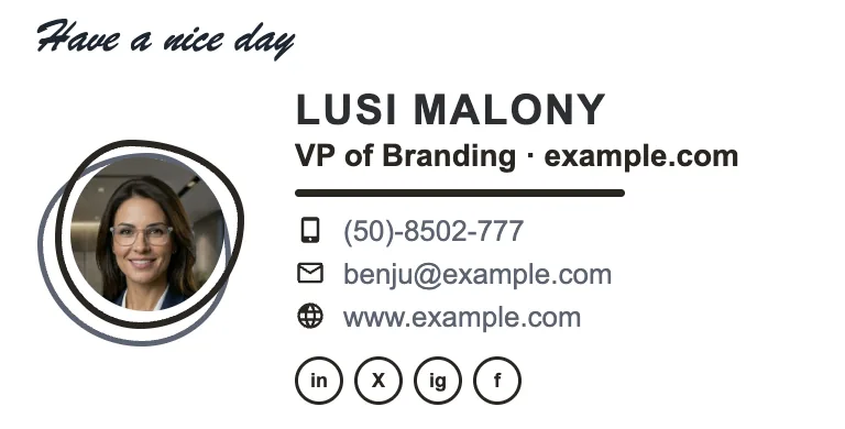
What a professional email signature should include
- Full name and job title — so people know exactly who they're dealing with.
- Company and logo — instant brand recognition.
- One or two ways to reach you — phone and website; skip the email address (they already have it).
- A few relevant social links — usually LinkedIn, plus one or two others that matter for your work.
- One call-to-action — a single button such as “Book a call” or “See our work.”
What to leave out
Professional means restrained. Avoid a wall of phone numbers, six social icons, inspirational quotes, large images, and “sent from my phone.” Every extra element dilutes the ones that matter. Aim for a signature a recipient can read in one glance.
Build one in the email signature generator and copy it into Gmail or Outlook — the layouts there already follow the rules below.
Design principles that make it look expensive
Consistent brand colors
Use one or two brand colors — the same ones as your website.
Clear hierarchy
Name largest, title and company smaller, details smallest.
Aligned, tidy layout
A clean two-column layout beats a stacked jumble.
Restrained icons
Matched social-icon styling, not a mismatched grab-bag.
A single accent
One colored button or divider — not five competing colors.
Sharp images
A properly cropped logo and headshot, never stretched.
Build one without design skills
ProSignature bakes these principles into 13 templates, so you get a professional result by filling in your details. Then install it in Gmail or Outlook, or roll it out to your team.
What actually makes a signature read as professional
“Professional” in an email signature is not a style — it is a set of constraints. The blocks that read as competent are almost always the ones that did less: six lines or fewer, one image, one accent colour, one call-to-action, and typography that does not try to be distinctive. What reads as amateur is remarkably consistent too — a quote, a second phone number, five social icons of which two are dead, a scanned handwritten name, a “please consider the environment” line, and a logo that is slightly the wrong size. None of those are matters of taste; they are additions that cost attention without returning anything. The discipline is subtraction, and the best-practices checklist is the two-minute version.
The hierarchy that works
Name — largest text in the block
It is what people scan for when they scroll back through a thread looking for who said something.
Role and company — one line, specific
“Bookkeeper for restaurants” is more professional than “Finance Professional”, because specificity signals competence and vagueness signals its absence.
Contact — one phone, one website
Whatever you actually answer. Listing channels you ignore is worse than omitting them.
Image — a headshot or a logo, correctly sized
Roughly 100-160px displayed, exported at 2x, hosted. See image sizes.
One call-to-action
A booking link, a portfolio, a quote form. Two compete; three are ignored. Wording in CTA examples.
Disclaimer only if required
And if required, small, muted and short — see legal requirements.
Professional also means it arrives intact
The most overlooked component of professionalism here is technical. A signature that is beautifully composed and arrives as a broken image box, or as unstyled text, or with an untappable phone number on a phone, reads as careless regardless of how it looked when you made it. That means email-safe HTML: inline styles because Gmail strips style blocks, table-based layout because Outlook renders through Word's engine, explicit width and height on images, and system font stacks with real fallbacks. It also means the signature must still make sense with images switched off, which is why text should never live inside a picture. Examples of blocks that satisfy all of this are in the examples gallery.
Written and maintained by the ProSignature team. Competitor pricing and feature claims on this site are verified against each vendor's live page on the day of writing — last verified 26 July 2026. No affiliate links. How we work.
Look professional on every email you send
Design a clean, branded signature in about two minutes.
Create my signature — freeFrequently asked questions
What should a professional email signature include?
Your full name, job title, company and logo, one or two contact methods, a couple of relevant social links, and a single call-to-action. Keep it to what a reader can absorb at a glance.
Should I include my photo in a professional signature?
A professional headshot adds trust and personality, especially for client-facing and sales roles. It's optional — many clean corporate signatures use just a logo.
How long should an email signature be?
Short. Three to five lines of text plus a logo is ideal. If a reader has to scroll to get past your signature, it's too long.