Home › Designers
Email signatures for designers & studios
Your signature is a portfolio piece clients see before the portfolio. It should be beautiful — and survive Outlook. That second part is where we come in.
Why your email signature matters for designers
Every designer has built a gorgeous signature that shattered in Outlook. ProSignature renders email-safe, inline-styled HTML that keeps your typography, spacing and palette intact across clients — so the signature that represents your craft actually looks like your craft everywhere it lands.
What to put in a designer email signature
Email-safe rendering
Inline styles that survive Gmail, Outlook and Apple Mail.
Exact brand palette
Pulled from your site, or dialed in by HEX.
Portfolio / Dribbble / Behance
Clean iconography for the links that sell your work.
13 refined templates
Including photo-forward and minimal layouts that feel designed.
Build yours in minutes
- Open the generator and enter your work email — your logo, colors and social links are imported from your website automatically.
- Pick a template and fill in your name, title and the details that matter for your role.
- Add a call-to-action button — the one action you most want recipients to take.
- Install it into Gmail or Outlook in one click, or roll it out to your whole team.
What belongs in this signature, line by line
The fields below are the ones this profession is actually judged on — by clients, by referral sources and in some cases by a regulator.
Name + discipline, specifically
“Brand identity designer” or “Product designer — fintech”. “Designer” alone covers a dozen unrelated jobs.
Portfolio link as the primary action
Design is bought by looking. Everything else in the block is secondary.
Studio or independent status
Clients budget differently for a studio and a solo designer.
Current availability
“Taking projects from October” — the same high-value line freelancers use.
One relevant platform
Behance, Dribbble or Instagram depending on discipline. Not all three.
A restrained signature — this one is a portfolio piece
Your signature is a design sample whether you intend it or not.
Your signature is a work sample
Designers are judged on their email signature more harshly than anyone else, because the recipient reads it as evidence of taste and craft. That cuts both ways. A cluttered, mismatched or badly-aligned block undermines a portfolio full of beautiful work; but the opposite temptation — an elaborate, image-heavy signature — fails for technical reasons the client will nonetheless read as your failure. Email clients strip web fonts, block images by default and render through engines with no CSS grid. So the craft here is working within those constraints: exact alignment, a restrained type hierarchy using email-safe stacks, one accent colour from your own identity, generous spacing. That is a more impressive demonstration of skill than any gradient. The technical rules are in best fonts and image sizes.
The trap of designing your signature in a design tool
The instinct to lay out a signature in Figma or Canva and export it as a PNG is strongest among designers and is the single worst outcome available. A flat image means no clickable email address, no clickable portfolio link, an empty box for every recipient with images disabled, blurry rendering on high-DPI displays, and extra weight on every email. Recipients cannot even copy your address. The correct workflow is to design the intent and then build it as inline-styled HTML — or use a generator that produces email-safe HTML from a layout you choose. Use image tools for the one element that should be an image: a campaign banner. The full argument is in our Canva comparison.
Mistakes that show up most in this field
Exporting the signature as an image
The most common and most damaging mistake in this profession.
Custom web fonts that silently fall back
Your careful type becomes Times New Roman in Outlook.
Three portfolio platforms listed
Pick the one where your best work lives.
“Designer” with no discipline
Brand, product, motion and interior designers share a word and nothing else.
Three layouts that work for this profession
Real renders, not mockups — this is the output that reaches an inbox. Under each is why that layout suits this kind of work.

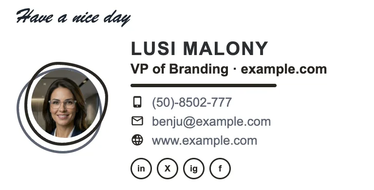

Written and maintained by the ProSignature team. Competitor pricing and feature claims on this site are verified against each vendor's live page on the day of writing — last verified 26 July 2026. No affiliate links. How we work.
Beautiful in the inbox, not just in Figma
Design it in minutes and install it in one click.
Create my signature — freeFrequently asked questions
Can I fine-tune typography?
Yes — email-safe font stack, size controls and label styles; enough control to feel yours without breaking clients.
Why not hand-code my own?
You can — but email HTML is a compatibility minefield. We maintain the quirks so you don't re-test 12 clients per tweak.
Does the studio team version lock the design?
Yes — creative directors lock the system; each designer gets their own details inside it.
What should a designer's email signature include?
Name with a specific discipline, a direct portfolio link, studio or independent status, current availability, and one relevant platform — built as clean HTML, not exported as an image.
Should a designer make their email signature in Figma or Canva?
Design the intent there if you like, but never ship it as an exported image: nothing is clickable, image-blocking hides it, and it renders blurry. Build it as inline-styled HTML instead.
How should a designer's signature look?
Restrained and precisely aligned, using email-safe fonts and one accent colour. Working elegantly within email's constraints reads as more skilled than an elaborate layout that breaks.